
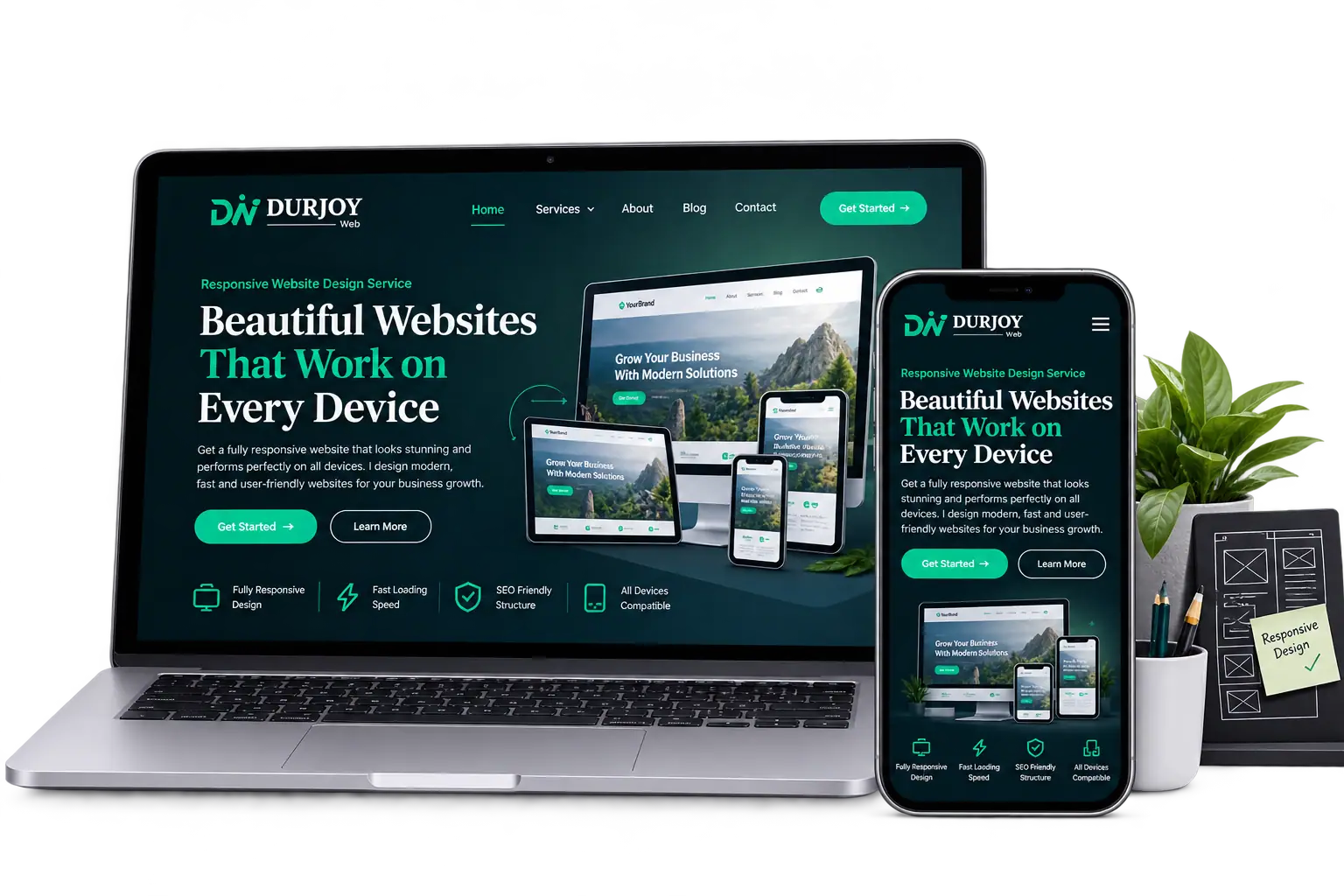
Responsive websites built to deliver a smooth, consistent, and user-friendly experience across desktop, tablet, and mobile.
I create responsive websites that adapt naturally to every screen size, keeping your design consistent, your content clear, and your visitors comfortable wherever they browse.
I carefully adapt every part of your website to create a smooth, consistent, and user-friendly experience across desktop, tablet, and mobile devices.
Layouts that adapt naturally to different screen sizes without losing visual balance.
Refined layouts, spacing, and navigation designed for a better mobile experience.
Balanced designs that provide a comfortable experience across tablet screen sizes.
Readable text sizes and spacing that adjust appropriately across every screen.
Buttons, menus, forms, and interactive elements designed for easy touch interaction.
Careful testing and refinement to ensure everything works smoothly across devices.
I combine thoughtful design, responsive techniques, and hands-on WordPress experience to create websites that work beautifully across every screen.
I carefully review spacing, typography, layouts, and interactive elements across different screen sizes.
I use WordPress and Elementor to build flexible, responsive websites that are easy to manage.
I design around readability, navigation, and usability to create a comfortable experience for every visitor.
I test and refine your website across desktop, tablet, and mobile before final delivery.
Every redesign is a collaboration built on trust, clear communication, and attention to detail. Here’s what clients have shared about working with me.
Always delivers exactly what you ask for, communicates easily, and consistently keeps his promises. 10/10.
Durjoy was excellent to work with. Managed to create a fully professional website as agreed with Elementor on WordPress. Wouldn’t hesitate to hire him again. Highly recommended to anyone in need of a website designer.
I had an amazing experience with Durjoy. He is fairly new to Upwork, but he exceeded my expectations in every way. He built me a website from scratch, and I couldn’t be more pleased. Well done Durjoy!
Working with Durjoy was a great experience. He paid close attention to the details, communicated clearly, and delivered a website that feels modern and easy to use.
I needed a website that looked professional and worked well on every device. Durjoy handled the design and responsive details carefully, and I’m very happy with the result.
I review your website to identify updates, issues, content changes, and areas that need attention.
I adjust layouts, typography, spacing, navigation, and interactive elements for desktop, tablet, and mobile.
I test every screen size, refine the details, and make sure your website works smoothly before delivery.
I carefully adapt, test, and refine every part of your website to ensure a smooth and consistent experience across every screen.
★★★★★
Trusted by Clients. Appreciated for the Work.
Whether you need updates, fixes, or ongoing support, I’m here to help keep your website reliable, functional, and ready for your business.
★★★★★
Trusted by Clients. Appreciated for the Work.
Responsive web design means creating a website that automatically adapts its layout and elements to different screen sizes and devices.
Yes. I optimize the website for mobile, tablet, and desktop to provide a smooth and user-friendly experience across devices.
Yes. I can adapt an existing website by improving its layouts, spacing, typography, navigation, and other elements for different screen sizes.
Yes. WordPress and Elementor are my primary tools for building and optimizing responsive websites.
The overall design and brand identity remain consistent, while layouts and elements are adjusted to suit each screen size.
I review the website across desktop, tablet, and mobile screen sizes, then refine the layout, spacing, typography, and functionality where needed.
Here are answers to some common questions about responsive design, mobile optimization, and working together.